When reflecting the two products I created throughout the course I feel it is apparent that I have developed my skills greatly in both the knowledge and use of the software and hardware involved. The improvements include the quality of image, in the school magazine (left) the image is stretched, grainy and badly set out whereas the image from the music magazine (right) has been edited using software such as photoshop allowing me to better the layout of the cover. I have also had more practice time with the camera allowing me to get a better quality of image.
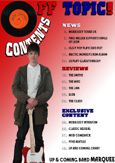
The contents page of my school magazine (left) was set out in a very plain manor with little colour but I still remain impressed with the quality of image for an action shot. The contents from the music magazine (right) has greatly improved. The layout of the contents doesn't look like it is being squashed into the available space unlike the contents from the school magazine, the masthead and contents don't look as basic and follow a more interesting and unusual style. The image is also edited into the page unlike the school magazine where the text was simply added over the image.
When comparing the Prelim product and the Final product you can clearly see that the skills I have developed throughout the course have hugely impacted the quality of the product and allowed me to manufacture a more professional product.


No comments:
Post a Comment